Tuesday, November 2, 2010

Why I don't want to be an architect.

Halloween weekend what a thrill. It's a holiday filled with ghost goblins and pouring with creativity. The best part of it is the holiday parties. Not just because it's another opportunity to drink with friends (though that's nice too). But because it brings out the creativity of those who would not otherwise consider themselves creative and because it gives you the opportunity to meet new people with their creative core on full display. So before a formal dialogue begins you have an in site to the type of person you're about to interact with.

In my socializing this past halloween weekend I was asked to answer the same questions we've all had to answer dozens of times before, what's your name? who do you know here? how do you know them? Where are you from? What do you do? Do you like it? Do you think that's what you do forever? I particularly like the latter three questions here because it gives you the chance to reevaluate your situation. It forces you to think about what you spend most of your waking hours doing.

The question that I personally have received several times when I reveal that I work as a graphic designer for an architecture firm is "So do you want to be an architect?" More often than not the answer is most definitely not, though there was some point where I thought that it would make a good subject to study for a master's program, but in retrospect I feel as though that was merely an overall desire to go back and acquire a masters degree in general. But I do not desire to be a career architect for two main reasons.

The first reason being the fact that it takes too long. If learned that architects entire working career may only produce one major project from start to finish that the architect can shoe off with pride. Sometimes an architect might have an entire career with no finial product to show for their countless hours of effort. So say if an architect does get that one dream job with a committed major client it will be a matter of years before they see what they've designed manifest itself in a tangible space.

The second reason I do not want to be an architect is that there are way too many restrictions involved in the process. If you generate the best concept known to man kind and make a sketch of a form that when created has an aesthetic that would instantly cause world peace. It has to be approved by the client, which is usually a committee that includes every single person that will ever or ever has the potential of going through the building, this may include but not limited to the management staff, the workers, the janitors, secretaries, the spouses of all the staff members and their offspring, security, and a group of randomly selected individuals that may never even be in the same country as the building but were consulted by the client. After that the building has to go through various engineers and has to be redesigned due to violations of safety codes and energy efficiency. After all of that the client will "value engineer" the project due to lack of funds cutting out most of the artistic aspects.

Nope the architecture field is not for me. But what I do respect and enjoy is the concept behind the physical space as being part of one big story / brand. A brand that extends from graphic design, architectural design, product design, interior design, staffing, and everything in-between is a beautiful thing.

Ok. That's the end of my rant. Try explaining that to a person you've just met while dresses as a character from the movie The Big Lebowski at a noisy Halloween party and see how quickly they finish the drink in their hand and insist they'll be right back after they get a refill.

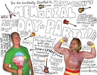
Below is a project that illustrates these differences between graphic design and architecture. This was a project that was completed in a matter of a few days and practically unlimited in the means of artistic creativity ( aside from reflecting the brand ). There was no real brief aside from the fact that it had to be engaging enough so that people would read and interpret the information. The graphic art was unfiltered and went straight from my computer out to it's audience.


Wednesday, September 8, 2010

Motion Graphics

I remember being a kid in elementary school after school care program and one of my favorite activities they would do with us was to take a full pack of index cards and a binder clip and draw card by card to produce a flip book. Like every kid I loved cartoons but I was really fascinated in how they were produced. I remember being very fascinated by the show Samurai  Jack because of the elaborate hand painted backgrounds of the late night cartoon. In older age I remember getting excited about MTV's idents and the pop up graphics on VH1's pop up videos.

Recently I've been trying more and more to work with motion graphics. I really enjoy learning new things. A friend of mine tipped me off to a great resource, videocopilot.net. This site has really helped me learn Adobe After Effects. But motion is something that I've always been attracted to. The addition of timing, motion and physics give art work a human feel that people can relate to. Still images instantly become alive. They move the way we move.

Learning motion graphics has been very natural so far due to my work in flash. Currently I'm working my way through over 100 tutorials on the videocopilot.net website in order to master the tools of the trade. Hopefully soon you'll see some original motion graphic projects coming from me. 


But until then please enjoy this college project of mine using a scanner and still images mixed with Photoshop effects in order to produce stop motion animation. I used pieces from a broken VCR and images/scans of myself to create tension between man and machine. It's loosely supposed to be a narrative about robots. Could androids exist? Maybe, maybe not but it was a lot of fun to do and the process matches the concept (a little bit of hand work and a little bit of computer).


Saturday, July 17, 2010

Graffiti and the Internet Repurposed


I was at the bar last night talking with some friends about graffiti art. I had to confess to them that I didn't know much about it, I didn't know any artist really aside from the really famous ones (i.e. Banksy and Sheppard Fairey) and the rest is from what I've seen on the streets and in books. But I did remember Blu (the artist above), who I really admire. My opinion on graffiti is that the medium has become diluted with crap. I think that the idea of quick tagging or illegibly writing your nickname in one color is truly vandalism. There is no artistic value in it and does nothing but kill the work of real artists. Then there is the style of graffiti that is performed over and over and over again. Whether is words with sharp angles that overlap one another or bubbly words with a gradient fill we've seen it done by countless amounts of people. This work by Blu pushes the boundaries of the medium and transforms graffiti into something new. He sketches and doodles and buildings become his paper.

The internet has fallen into the same scenario as graffiti. We see wonderful usages of the technology medium buried among terrible websites with bad typography and cheesy stock images. Then clean corporate websites are a dime a dozen with the invention of pre-made web templates. But there are a few designers and artists that take the medium and see it in a different light. Or artists that take technology and express strong messages in clear way like Banksy does with graffiti.

Monday, July 12, 2010

Doodles

I know it's been a while since I've posted. I've been busy working on a logo and to be honest logos have never been one of my strong suits. Sure I can crank out a mediocre logo under pressure that ranks a hair above average. But to make a symbol that embodies the full breath of a company where every last detail is caressed over. Well let’s just say it was a long and challenging process (over two months). I invested hours upon hours over the course of several days with minimum sleep. In the end I really feel as though I made a break through. Now I have a real love and passion for working on and working with identities. My secret was to just tackle how I work and develop my process.


It was simple, really. One little piece of advice instructors have tried to engrave in my mind since I was a teenager: Carry a sketchbook. Seems simple enough, you say. But after spending years and years dragging a sketchbook around everywhere (so I would have the minimum number of entries by the end of the quarter to receive a passing grade) the last thing I wanted to do after graduating college was to keep a sketchbook on me. I wanted to finally be rid of art school once and for all! Those endless pages would no longer haunt me. No more long nights of sketching. No more would I have its icy glare back at me as I go to take a pen or book out of my knapsack.

It went well for a few years, or so I thought, till one day a visitor to my desk noticed a tiny sketch in the corner of a piece of paper on my desk. It was nothing really, I hadn't even remembered drawing it. I must have just let it flow through my hand without thinking, while I was waiting for my ancient underpowered computer to fail exporting a PDF from inDesign for the fourth time and listening on the phone to a 20 minute apology from one of the team members I’m helping to complete the proposal (it happens). I began looking at all the other papers I had lying around my desk, my notebooks, envelopes, post-its, everything that had a surface to draw on I must have made at least one small doodle. How long had this gone on? All along I had been keeping a sketchbook but since I had disregarded my teachers’ advice, my ideas were scattered all over.

So again, I am carrying a sketchbook to catch ideas as they randomly appear; it’s helped me tremendously, especially with my most recent projects. But you might be wondering what became of the scatter of doodles that had crept onto various work materials on my desk. Well, a colleague of mine made a great suggestion to begin scanning them in and even developing my free flowing doodles to the next step. What you see incorporated into this blog post are some of the main sketches from my doodles on papers around my desk and the illustrations I’ve begun to develop since scanning them in. You’ll also see some of the sketches from the logo I’ve been busy designing.


Thursday, May 6, 2010

New, Old, and New Again


“Times have changed.” I thought as I stood playing with the newest digital reader on my most recent trip to Best Buy. Media that was once intended for print has now become a few bytes. This allows people to have easy instant access and have large collections occupy a small space. We’ve seen a similar transformation already occur. The CD section, which used to extend about 1/3 of the store, has now been reduced to two measly rows due to the availability of mp3 downloads. Music’s main purpose now is to be produced digitally with limited CD production. But I noticed something interesting as I perused Best Buy’s sorry little music section. There is was over the edge of the new Gorillaz album, staring at me from one row back was the new Muse album cover on a glorious 12” vinyl record sleeve. The transformation has gone full circle giving the user more options for how they intend to use the product. I predict that books and writing will take a similar path.

The project shown is one where I was exploring this usage of unintended mediums for written works. Just as printed books become digital and music recorded digitally becomes vinyl this piece shows a blog intended to be digital as a printed work. The piece was an invitation to a reading of a blog novel. The concept was to use a glossy stock for the cover to mimic the texture of a computer screen and a quality news print feel stock for the pages of the book themselves giving them a paperback look and feel. Text on the envelope, inside and outside cover was written in san serif html format text, which creates a good tension with the clean serif font of the inside pages. For now this was a fun little experimental project, but who knows maybe one day on a cold winter night you’ll be in front of the fireplace in your most comfortable chair reading volume 3 of your favorite hardback blog, To Be Determined Blog Chronicles.

Tuesday, April 20, 2010

The Mark

A mark is one of the most powerful modes of expression. An individual conjures up a thought, which travels through their limbs to a tool ending in a stroke on the surface with a direct connection to the source of the thought. These marks of expression are then taken in by others and the thought has a direct connection from one individuals mind to another.

Many artist have used and explored the limits of human expression through the process of making stokes and marks. A prime example of one such artist is Cy Twombly. Twombly has displayed works of art that some would see as pure scribbles. But there is no denying these illegible scribbles give a sense of emotional expression extending from Twombly himself.

Readability is not an issue when it comes to the works of fine artists. Designers need to worry about the messages being clear, words readable, and delivering information to the most people. Printing presses, cameras and computers have added clarity to the messages to they’re easily interpreted. The problem with these tools and their method of clarity is often times the human connection, which engages the user to view the work in the first place, is lost. The individual expression is gone and the messages blend in with one another because they have no unique personality.

So what’s the solution? Is there a balance between retaining the hand made mark and still effectively delivering the message? The works below are some of my attempts. I tried to produce these works quickly and a spontaneously without being overly concerned of legibility. The computer was used to recreate the works and send them to the masses. The result, people noticed the works and so engaged that they took the time to read every word in the piece.


Thursday, April 15, 2010

War Dog Gang Branding


Check out this logo I'm working on. It started as a joke to brand the gang my dad and his buddies formed in High School called the War Dogs. He met up with these friends over the family Christmas vacation back to Iowa where he grew up. It's still a joke but now a lot cooler. I'm still working on this one and will probably put it on the website when it's finished.

We had a little gang too in High School. We called ourselves AJRchy and our following the AJR Army. Our symbol wasn't nearly as cool as the one for the War Dogs is shaping up to be. Even so I must have drawn that thing hundreds of times.

Wednesday, April 7, 2010

Design Purgatory


This blog began as an idea, that occurred when I was developing my website and adding projects to my portfolio. I was looking through all the projects I had completed since the last version of the website and realized I had a plethora of projects. Of these countless amounts of projects I picked the best of the best to take the pedestal on the pages of my website.

But what about the other projects? Projects that began as great ideas or showed a new skill only to be cut short due to budget cuts, time restraints or ideas that have not yet found their purpose. Where do they go?

The Catholics have a belief in a place called Purgatory or Limbo. This is a place where individuals go when they die with sin that has yet to be forgiven. The deceased remain in this place to repent for their sin till it is forgiven and they're allowed to pass into heaven. While in Purgatory it is common for people to pray for the deceased to help them grow in holiness.

This blog is Purgatory for my projects and experiments. It is a place where I can reflect on what has worked and what hasn't, where ideas can grow and pass on to great projects, and where you the reader can provide support and direction to help me become a better designer. I hope you enjoy what I have to show and say. 

Please visit often and let my know what you think. I'll try my best to update as often as possible.